With the growing variety of devices used to access the web, from smartphones to tablets and desktops, a website must be adaptable.
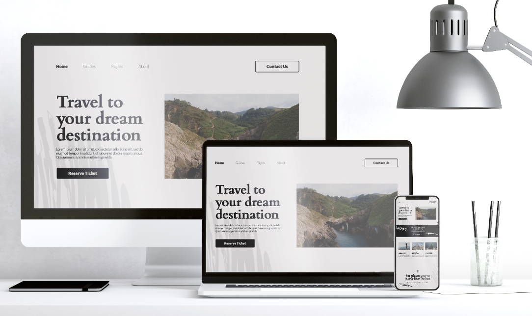
This adaptability is achieved through responsive web design, which ensures that a site looks and functions seamlessly across all devices.
Here’s why responsive design is essential for business success:
1. Broadened Audience Reach and Accessibility
Responsive design expands your reach by making your website accessible on any device. With the increasing use of smartphones and tablets, a website that isn’t mobile-friendly risks losing a significant portion of potential customers. A responsive site adjusts its layout according to the device’s screen size, making it easier for users to navigate and interact with your content. This universal accessibility helps attract and retain a broader audience, crucial for business growth.2. Boosted Conversion Rates
A responsive website enhances user experience, which directly impacts conversion rates. When users find your site easy to navigate on their device, they are more likely to stay longer and engage with your content. This improved engagement often leads to higher conversion rates, whether it’s making a purchase, signing up for a newsletter, or contacting your business. A smooth and enjoyable experience across all devices helps turn visitors into customers.Also Check: A Beginner's Guide to Effective Web Development
3. Strengthened Brand Consistency
Brand consistency is vital for establishing trust and recognition. Responsive design ensures that your brand’s look and feel are consistent across all devices. This uniformity helps reinforce your brand identity and provides a cohesive experience for users, regardless of how they access your site. Consistent branding builds credibility and reliability, crucial elements for business success.4. Cost-Efficient Solution
Investing in responsive web design is a cost-effective strategy. Traditionally, businesses had to create and maintain separate websites or mobile applications for different devices. This approach is not only costly but also time-consuming. Responsive design eliminates the need for multiple platforms by allowing a single website to adapt to various screen sizes. This consolidation reduces development and maintenance costs, making it a more efficient and economical solution.5. Enhanced SEO Results
Search engines prioritise mobile-friendly websites in their rankings. With responsive design, your site is automatically optimised for all devices, which improves your SEO performance. Google’s algorithms favour sites that provide a seamless user experience, and a responsive design helps ensure that your site meets these criteria. Higher search engine rankings lead to increased visibility and organic traffic, benefiting your business.6. Improved Mobile Usability
Mobile usability is critical in a world where mobile traffic is on the rise. A responsive website ensures that users on smartphones and tablets have a positive experience. Features like touch-friendly navigation and optimised layouts for smaller screens improve usability. When users can easily interact with your site on their mobile devices, they are more likely to engage with your content and return for future visits.Current Trends and Advancements in Responsive Web Design
The field of responsive web design is continuously evolving. Here are some key trends and advancements:- Mobile-First Design: Focus on designing for mobile devices first. Then, scale up the design for larger screens. This approach ensures a solid foundation for mobile users and a seamless experience across all devices.
- Fluid Grid Layouts: Utilise flexible grids that adjust dynamically to various screen sizes. Fluid grids allow for better adaptability, ensuring your layout looks great on any device.
- Adaptive Images: Implement images that adjust their size based on the device’s resolution. Adaptive images ensure faster loading times and a better visual experience on different screens.
- Progressive Web Apps (PWAs): Combine the features of web and mobile apps for a superior user experience. PWAs offer offline capabilities, push notifications, and a more app-like interface.
- Voice Search Optimization: Optimise content to cater to voice search queries. As voice search becomes more prevalent, adjusting your content for natural language and conversational queries can improve search visibility.
Keeping up with these trends is essential to maintaining a competitive edge and delivering an exceptional user experience.
Also Check: SEO Services to Boost your Online Presence
5 Important Points While Implementing Responsive Web Design
1. User-Friendly Navigation and Experience
Ensure that navigation is intuitive and easy to use across all devices. Menus should be accessible and functional on different screen sizes, providing a seamless user experience.2. Strategic Content Display
Prioritise and organise content based on the user’s device and screen size. Make sure the most important information is prominently displayed, enhancing readability and engagement.3. Efficient Image and Media Handling
Optimise images and media for quick loading on all devices. Implement responsive images that adjust their size and resolution based on the screen, ensuring smooth performance.4. Optimal Performance and Load Speed
Ensure fast loading times to keep users engaged and reduce bounce rates. Optimise your site’s performance to provide quick load times on all devices, improving overall user satisfaction.
These considerations will help you create a responsive design that enhances user experience and supports your business goals.
Conclusion
By focusing on responsive web design, you position your business to thrive in a mobile-first world. Embrace these practices to enhance your brand's visibility, improve user engagement, and achieve long-term success.Let Nautics Technologies Your Partner in Responsive Web Design
Nautics Technologies specialises in delivering cutting-edge web development solutions, including responsive design services. Our team of experts ensures that your website performs flawlessly on any device, enhancing user experience and driving business success. Whether you need a complete redesign or optimization of your current site, we offer tailored solutions to meet your needs.Ready to elevate your online presence? Contact Nautics Technologies today to discover how our responsive web design solutions can transform your business.